In love with aspens – Abstracted forest painting by Holly Van Hart (new release)
Do you love aspen trees as much as I do?
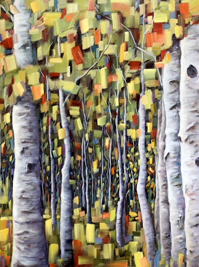
These days, I’m happily immersed in autumnal aspen forests. There’s something about these trees that seems to be universally appealing. For one thing, they are so gorgeous.
Aspens and birches look very similar to each other. If you’re curious what the differences are, here are the highlights –
- Birch are famous for having bark that peels back like paper; aspen bark does not peel.
- Birch trees grow in the eastern US and Canada, while Aspens are found all over North America, Europe and Russia.
- And, amazingly . . . each ‘colony’ of aspen trees actually shares a single large root system. The root system can be huge, covering multiple acres, and can be thousands of years old. As old trees die off, the root system sends up new trunks. Incredible!
How about you . . . what are your favorite trees?
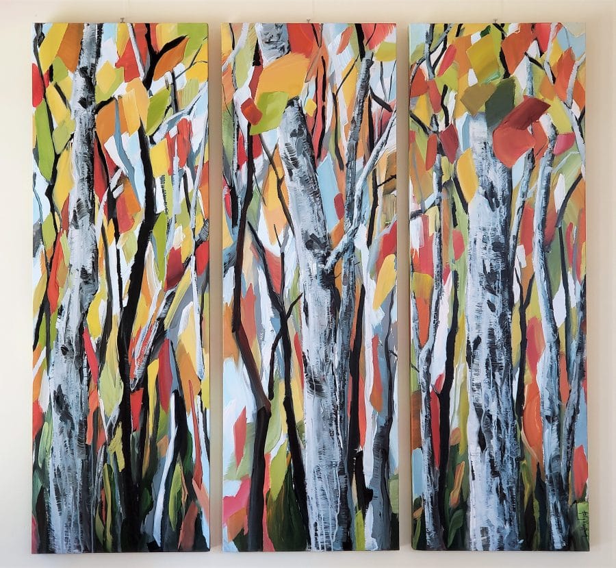
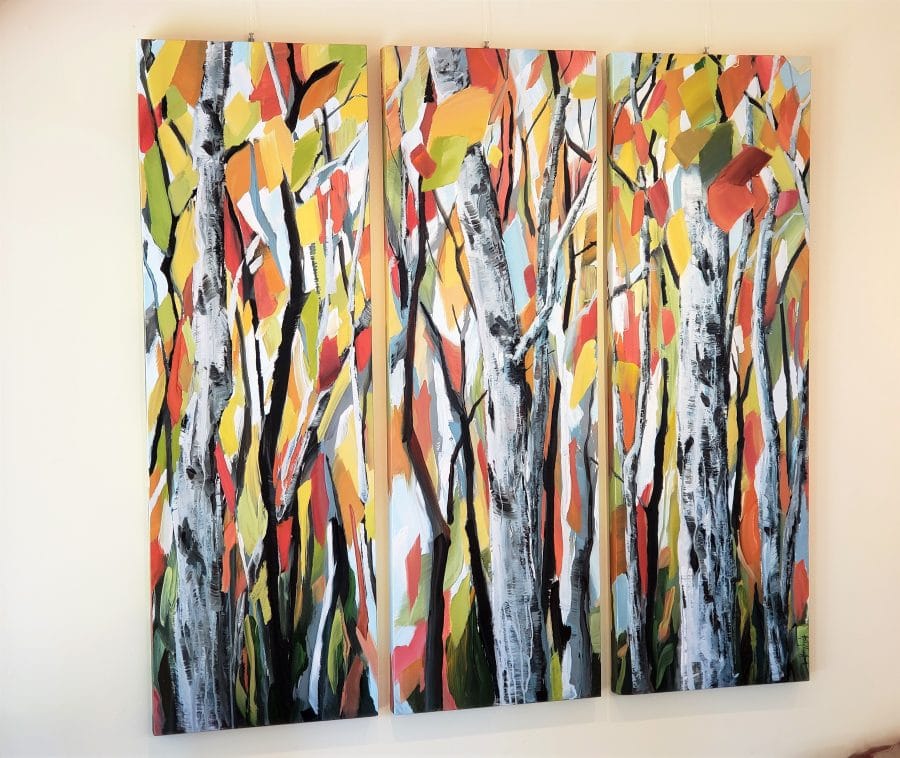
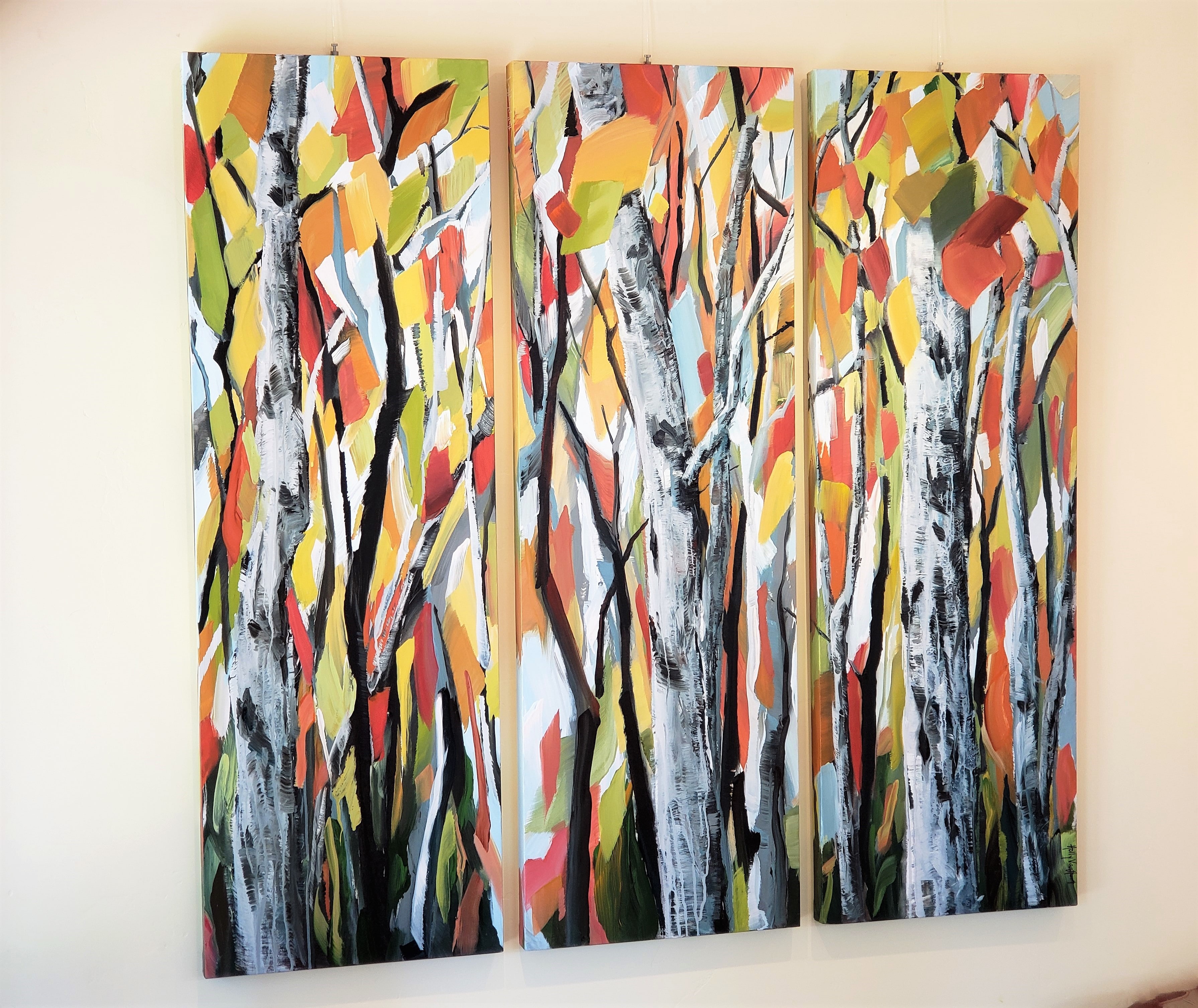
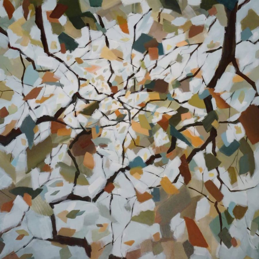
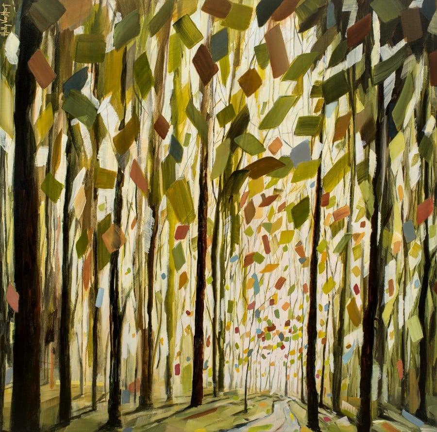
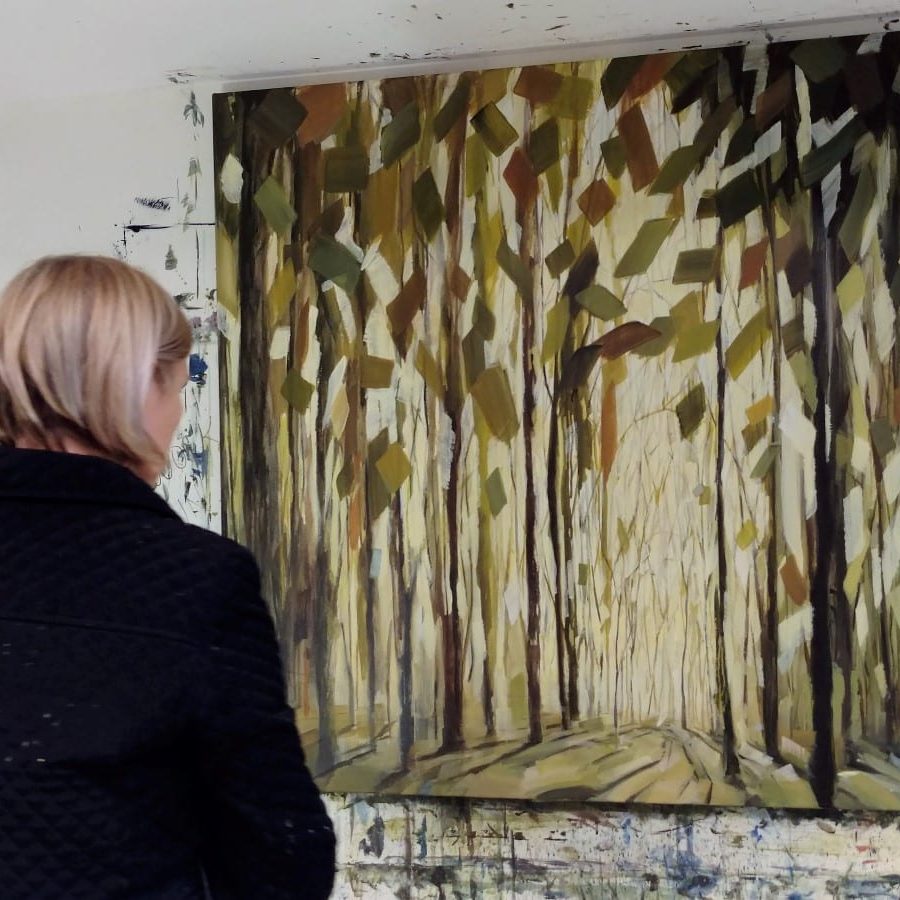
Here’s the completed painting, shown from two different angles –
-
-
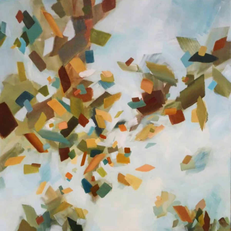
Breathing Autumn
54 x 54″ mixed media painting by Holly Van Hart
(Three 54 x 18″ canvases, installed)
$7500
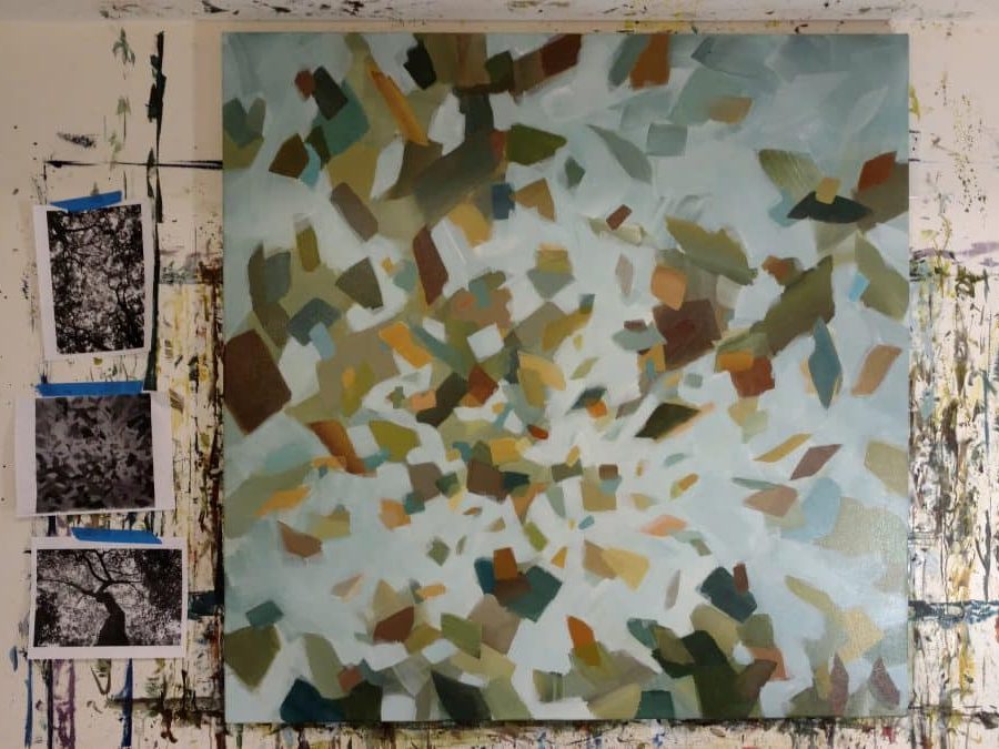
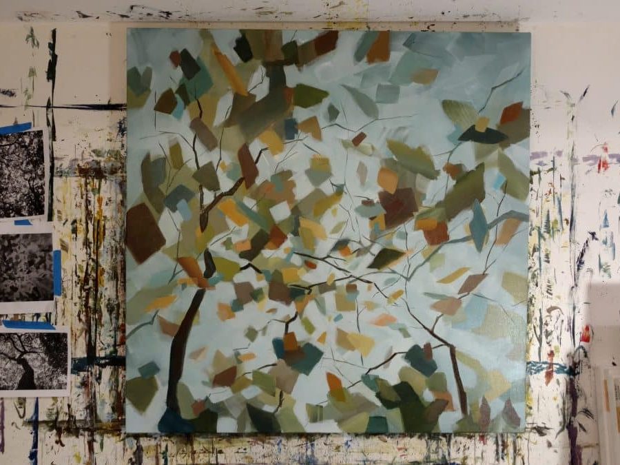
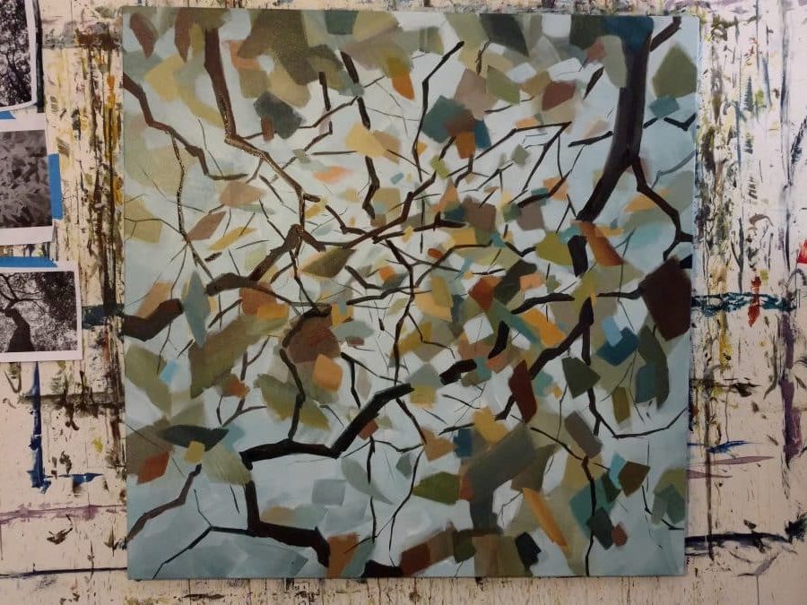
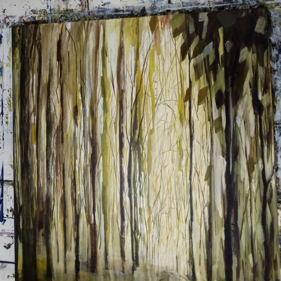
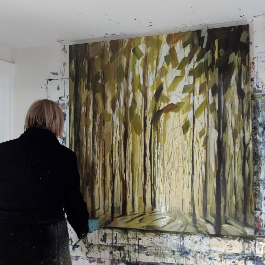
Story behind the painting
-
-
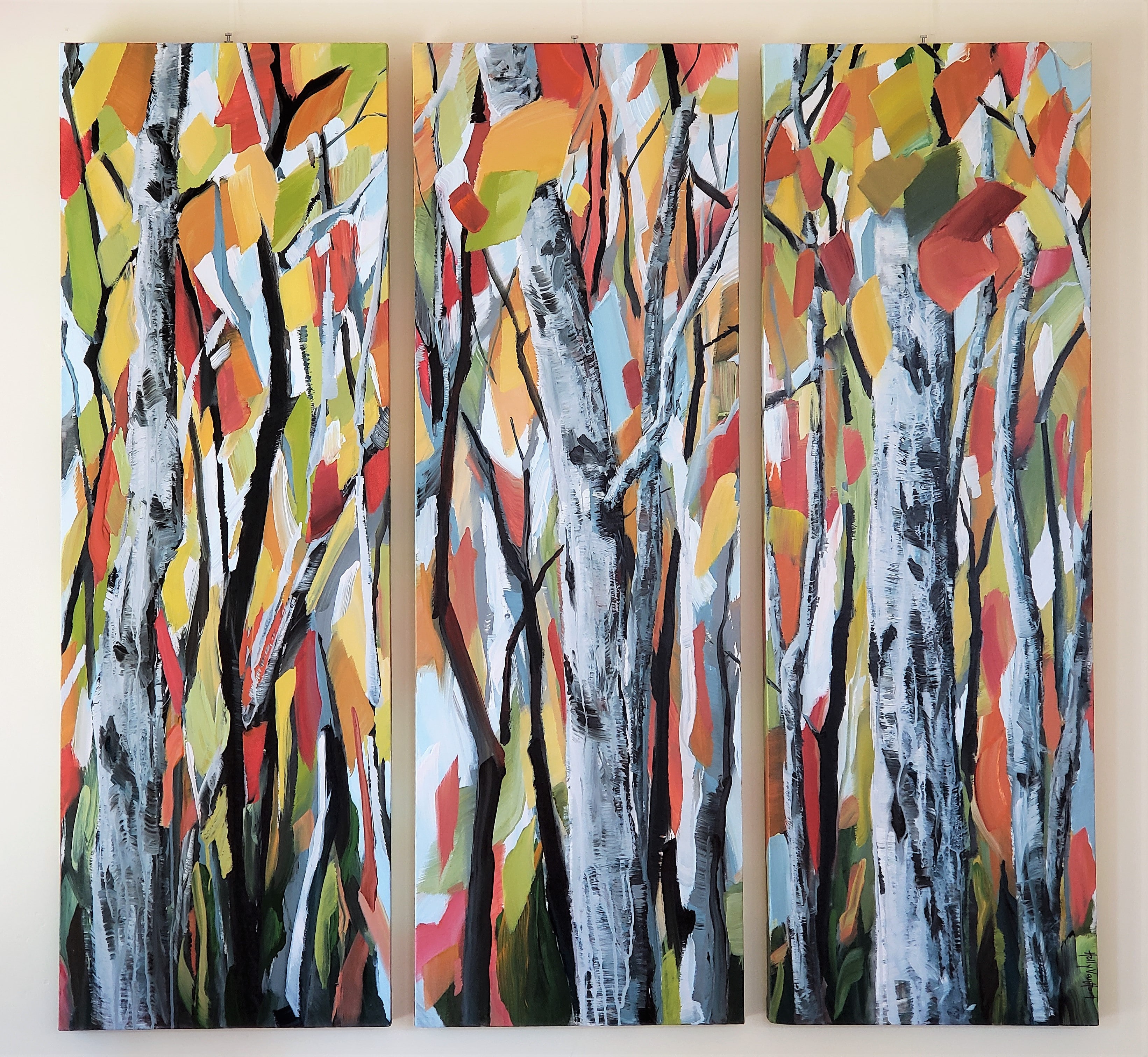
Breathing Autumn
54 x 54″ mixed media painting by Holly Van Hart
(Three 54 x 18″ canvases)
$7500
This painting is hanging in my living room, but it could hanging be in yours 🙂
Would you like to see this painting in person?
To purchase, email holly.vanhart@gmail.com. Free shipping in the US for VIP members.


")